on permanence: album art as aesthetic object

Lately I've been burdened by a tug of war in my brain about whether it's reasonable to be so bothered by artists like Taylor Swift and Sabrina Carpenter and Lucy Dacus not being able to stick to one album cover. I'm not sure it's even really a "trend" or anything. I just can't stop thinking about it.
I never liked the cover for Lucy Dacus's Forever Is A Feeling– I think a frame is a really hard aesthetic choice to pull off and that's my huge issue with the original. It doesn't help that I don't particularly like the album. Taylor Swift has half a dozen "alternate" album covers that don't have an obvious "best" or "main" one. Sabrina Carpenter has as many, but she also can't seem to commit to one ending for her bad second single's music video.
current hyper fixation: Sabrina Carpenter changing the tears music video ending 4 times to give a man 4 different fates. pic.twitter.com/zaXd8ihO6K
— Send Help (@sendhelpbetches) September 4, 2025
The new version of the Lucy album cover is objectively better, but the delivery of the decision to change it with a "because I want to!" strikes me as cowardly. I think other covers being proper deluxe editions is totally fine. That's always been a thing. It's reasonable enough. This isn't that, though.
I understand this being unable to stick to – or pick! – one singular album cover is about consumerism and enticing people to buy more versions of the same things or, at very least, keep posting the different versions (of what should just be a photo booklet inside the CD or record) to keep the online discussion at a fever pitch. It's about collector mentality lining the pockets of labels and artists. It's about marketing. It's about turning music into content any way they can. It is transparently greedy and plays into the type of I-Love-Marketing pop fandom that I just fundamentally don't respect.
the concept of ur fans lecturing u on “deliverables”
— Tobias "the pen" (@Tobiasfornow) August 20, 2025
But it's not really interesting to think about how this is all about marketing and consumerism and blah blah blah. We all know that's why pop music is what it is. I have spent so much time thinking about this that what is nagging at me isn't about an attitude toward pop musicians – or highly successful singer songwriters of whatever type – and the consumerism surrounding them. I think the unwillingness to commit to a singular album cover is much more depressing because, to me, it's a full abandonment of permanence of imagery. And if you admit there is no reason to commit to singular, focal imagery in favor of vibes of an era (which have a place – love a good photo booklet with lyrics in a CD or record!), I think you're devaluing art of album covers and, in turn, devaluing the impact of records in general.
If there were 7 different versions of Britney Spears' ...Baby One More Time would that diminish how iconic that cover is? I think so. There is an alternate cover for international audiences and that's fine, but if there were a bunch of similar vibe photos used as covers, what does that do to the cover? I think it ruins it. The original (official?) cover of Man's Best Friend by Sabrina Carpenter got a good amount of backlash and online discussion.
Then she gave a bunch of alternates and it doesn't really matter. Your album cover should not read like an editorial shoot in a fancy fashion magazine. I think the photos are beautiful, but if there isn't one clear vision for the art I think it diminishes the overall impact of an album.
I care a lot about album art. Maybe because I'm a pure of heart music lover, but probably more because I love photography as an art and I care deeply about physical objects. I care a lot about design and think albums communicate so much through the design and art that you hold in your hands – or reblog photos of or look at on a screen or whatever.
An album is not just music, it is also an aesthetic object. It is important that albums are also aesthetic objects. It's not just relevant as marketing, it is relevant as an element of artistic experience. I think even digitally albums are aesthetic objects. Even having no album art loaded into your mp3 software is an absence of intentional visual, but it is not without visual. Your experience is still clouded by the placeholder. When I was in Pittsburgh last weekend I bought several beautiful books, one of them being a book length essay by Laura Lopez Paniagua called Mike Kelley: Materialist Aesthetics and Memory Illusions. In it she says there is no way to separate an object from the way it appears, and that's what I'm trying to get at. Music can sometimes be just auditory experiences. Albums cannot. Albums are objects – pieces that are inextricable from the visual art you experience it with. That doesn't mean it's static, but it does feel permanent.
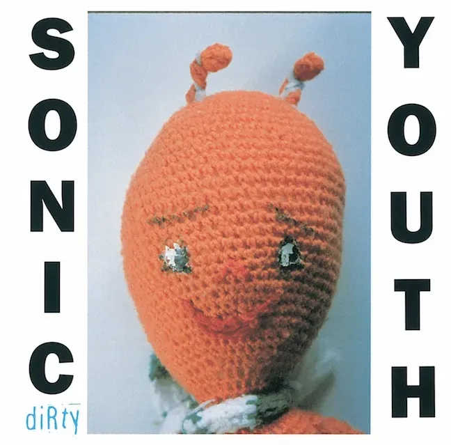
Mike Kelley did a lot of work I'm really fond of. I've seen a lot of it at contemporary art museums all over the US and Europe. Much of it is chaotic on the surface. One could say maximalist. Much of it deals in installations that evoke childhood and memories without feeling too heavy handed or concerned with juxtaposition the way some stuff that is similar on the surface can be. Lopez Paniagua's book is focused on his post-1995 work where his real focus on memory starts to ramp up, but Sonic Youth's 1992 album DiRty uses a photo of his for the cover and other images made by Kelley throughout the booklet inside.

Obviously, the soft plushy alien on the cover of DiRty evokes an idea of memory and associations with childhood, but I think when we look back on DiRty there is so much in the visual presentation that is to be remembered. Chloë Sevigny's first film appearance in a music video! Mark Jacobs for Perry Ellis! Iconic contemporary artist doing the cover! And at the center of it, of course, is that it's a major label album. Grunge as mainstream culture. Visual presentation of the world as it exists around, and in tandem with, Sonic Youth.

All of those things are great and beautiful, but it's all under the looming shadow of the cover. The little knitted alien with the text.
Even the book I've been reading about Mike Kelley is presented in such a way that is inextricable from my experience with it. The margins are tiny. The font is sans serif and rounded. It evokes the books and info panels you can look at in any contemporary art museum in the western world – a little bit more informal. There is a huge amount of white space at the top of each page with footnotes in the header space instead. You can feel that it's a book to deal with contemporary art because of the way the text is set.
I bought other books in Pittsburgh, Fresh, Green Life by Sebastian Castillo and To Photograph Is to Learn How to Die by Tim Carpenter, that have many of the same experiences. The former, a short book with generous margins that only serve to bolster the claustrophobia and abrasiveness of the narrator's internal monologue. The narrator's borderline insufferable perspective on himself – self aggrandizing but insecure – works with an overly dramatic amount of white space. The latter, with a title referencing Michel de Montaigne, meditates on aesthetic objects and the creation of them as essential practices in understanding human mortality. It's beautiful in it's compact size and alternating black, blue, and red text – each representing a different, but intersecting, utility. Visual interest with purpose. Beauty as not just cocoon, but as point. These things are inextricable from the way they appear. My experience would not be the same without the presentation being what it is.
Objects are not just objects. Images are not flippant. They aren't just marketing material. They aren't just incidental. Covers and layouts and presentation are all intrinsic to how people experience writing and music and films. Album art is not incidental. Even album art that isn't done by iconic artists – maybe especially album art not made by artists that become iconic – is important to the experience. It's a huge part of what forms my feeling toward the music and art as a whole. It makes me profoundly depressed to watch album art be devalued into just a series of images to post online without any real sphere of internal life to the main image.
I think this is a devaluation at its core which, in an age of AI, is something we should be even more sensitive to. If your album art doesn't have to last or work in any larger context or be something aspiring to permanence, I don't see why many people would not turn to easier means of conjuring images to have for posting online.
You can acknowledge that music in the internet age probably is ephemeral – that it is not going to last forever, that we are climbing up a hill of soft sand. I just don't think we have to treat everything about it as something that won't last. I think we have to lie to ourselves that we are making something – and looking at something – that will last forever and, with that, is worthy of being analyzed and taken seriously forever. Permanence should be an aspiration we're unwilling to give up.
Even if your album art is ugly. Don't be a coward.
Miranda Reinert is a music adjacent writer, zine maker, podcaster and law school drop out based in Chicago. Check out PDFs of most of my zines at the link on the top of the screen. Follow me on Twitter or Bluesky to keep up on the next time I write about album art: @mirandareinert. This blog does have a paid option and I would so appreciate any money you would be willing to throw me! You may also send me small bits of money at @miranda-reinert on venmo/on Paypal if you want. As always, thanks for reading!
Comments ()